One massive product we manage at KOALA is the user dashboard.
The dashboard is a critical feature for both owners and travelers, though the two use cases are wildly different and thus there are unique components in both. The dashboard design was made more critical and intricate when we introduced membership tiers for owners, each with access to different services and products.
I will demonstrate the significant updates to the design, but more importantly, the Information Architecture changes enacted, allowing users to locate their relevant tools and utilize their dashboards effectively.
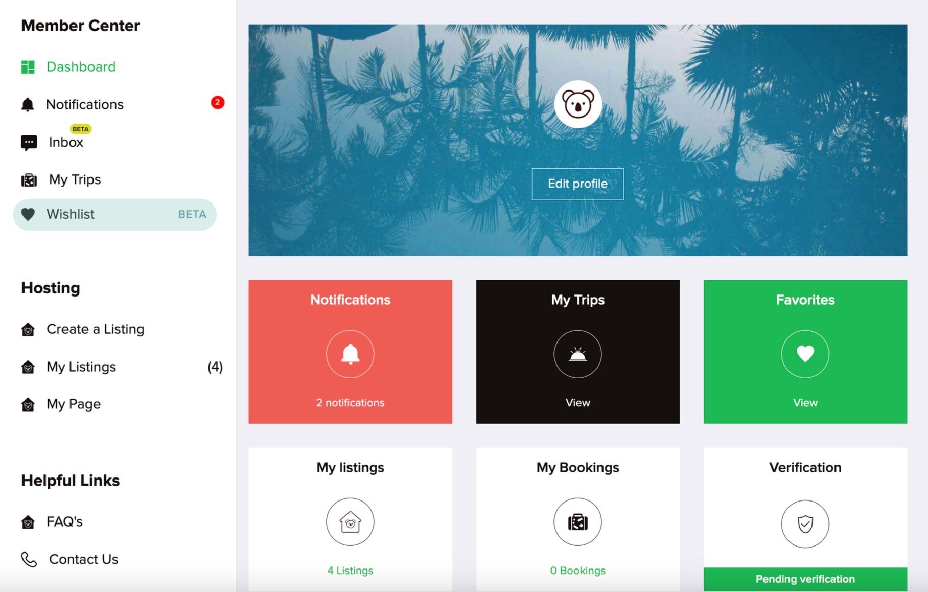
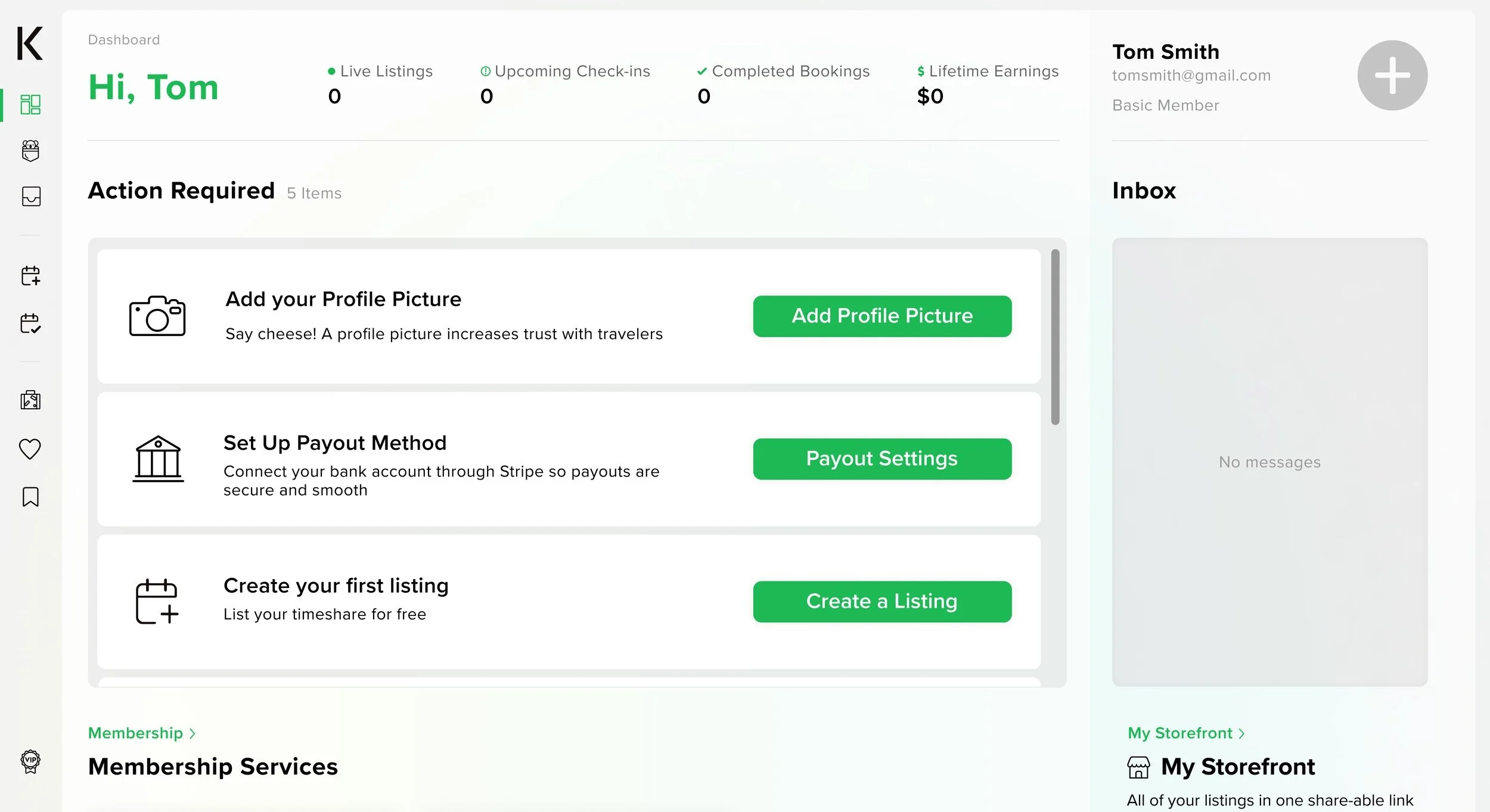
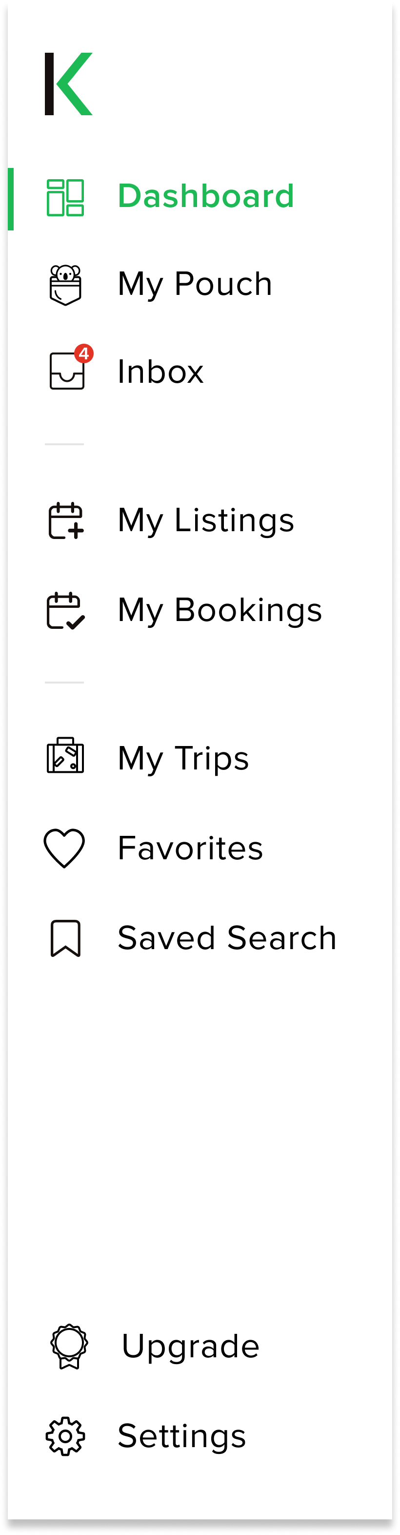
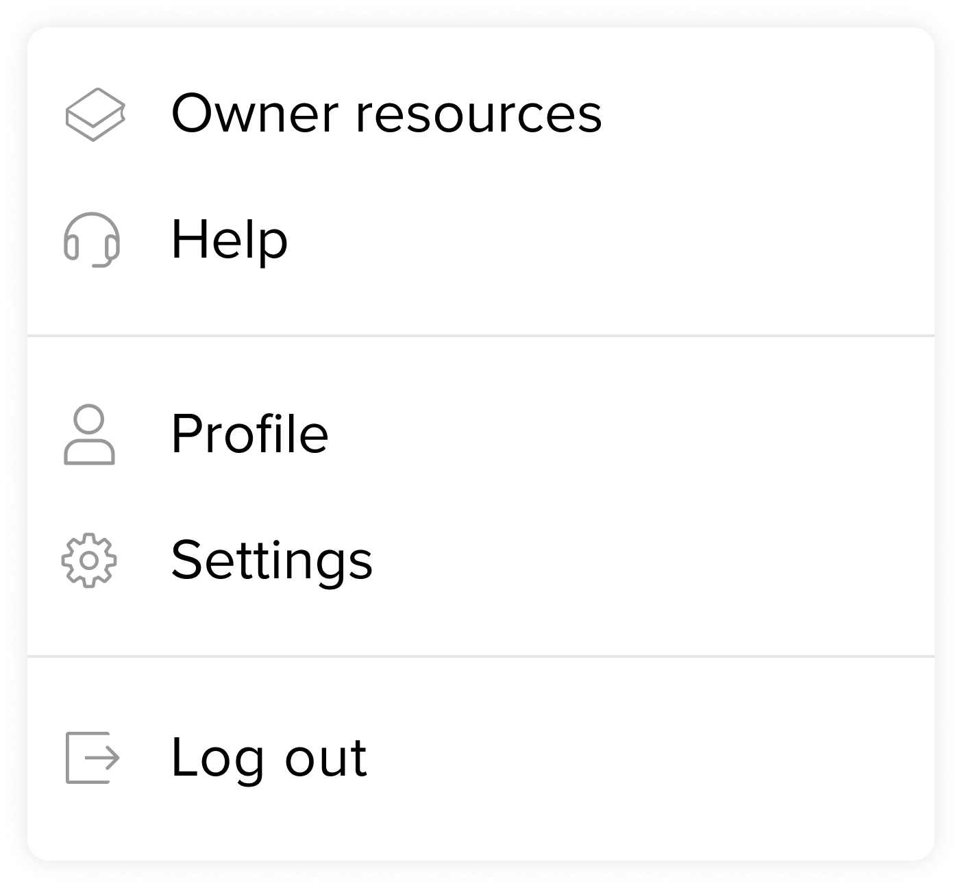
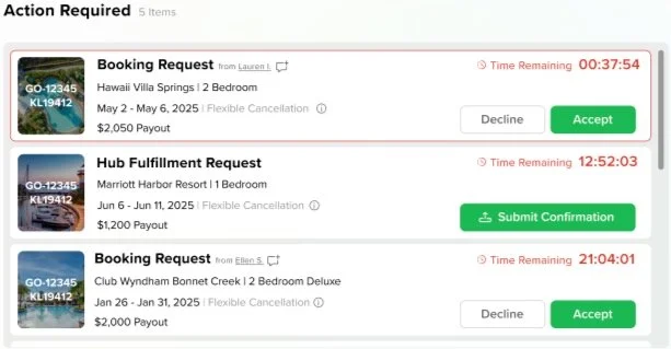
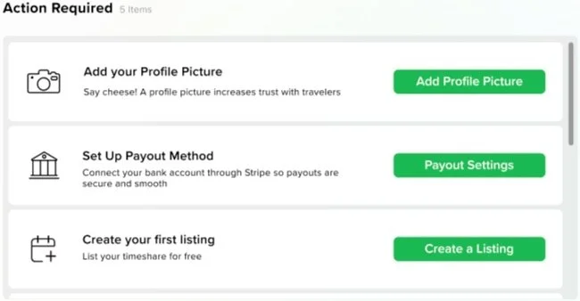
Above are the original and updated dashboard designs
The dashboard redesign involves a complete overhaul of the existing layout, so I have broken the component changes into the following sections: improved navigation, highlighted ‘required action’ section, gamified progress tracking, and p2p messaging inbox.